Neighbourly has been one of the largest projects I have worked on as an employee of IdeaHQ. My responsibilities spanning UI and UX design, frontend coding, animation, designing logos, pages and marketing material for partner campaigns, looking for and solving frontend programming bugs, and more. Here area few examples of the work I have done for Neighbourly.
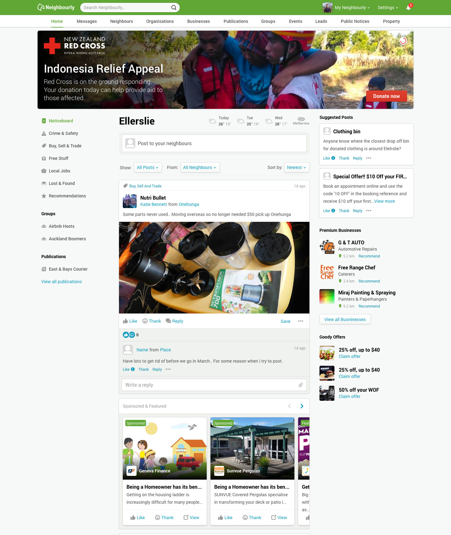
Designed and coded a space for charity organisations to advertise their campaigns. These ran across the top of the Neighbourly homepage. I designed the advertisements to be contextual in a way that use actual content, as opposed to just images. The idea behind using this new format was that these would be picked up by search engines and hence improve page rankings.
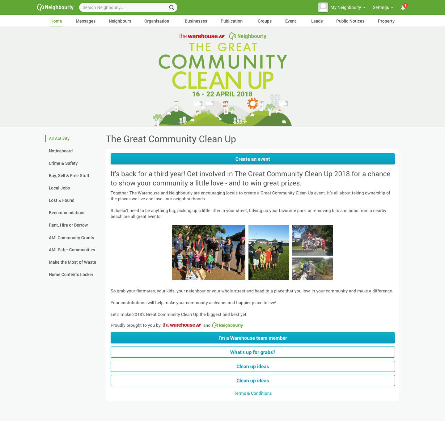
Redesigned the existing campaign pages for our partners. These initially had popups with the campaign information - which were extremely unusable on mobile phones. In addition to this, every campaign required new CSS classes to be created based on the number of CTAs shown. This required a lot of trial and error and excessive time spent on creating those custom classes each time a campaign was to go live. Neighbourly also has a 50%+ mobile usage, and hence the UX needed to be improved upon. My solution was to remove all popups and replace them with collapsable sections. This was scalable across all new campaigns and worked flawlessly regardless of the devices used.
Neighbourly advertisements were to be placed across the field for the Rugby League. The team needed a quick solution which showed how the Neighbourly user base is increasing each day. I had to storyboard, design and animate the advertisement in less than 2 days. This was the result.
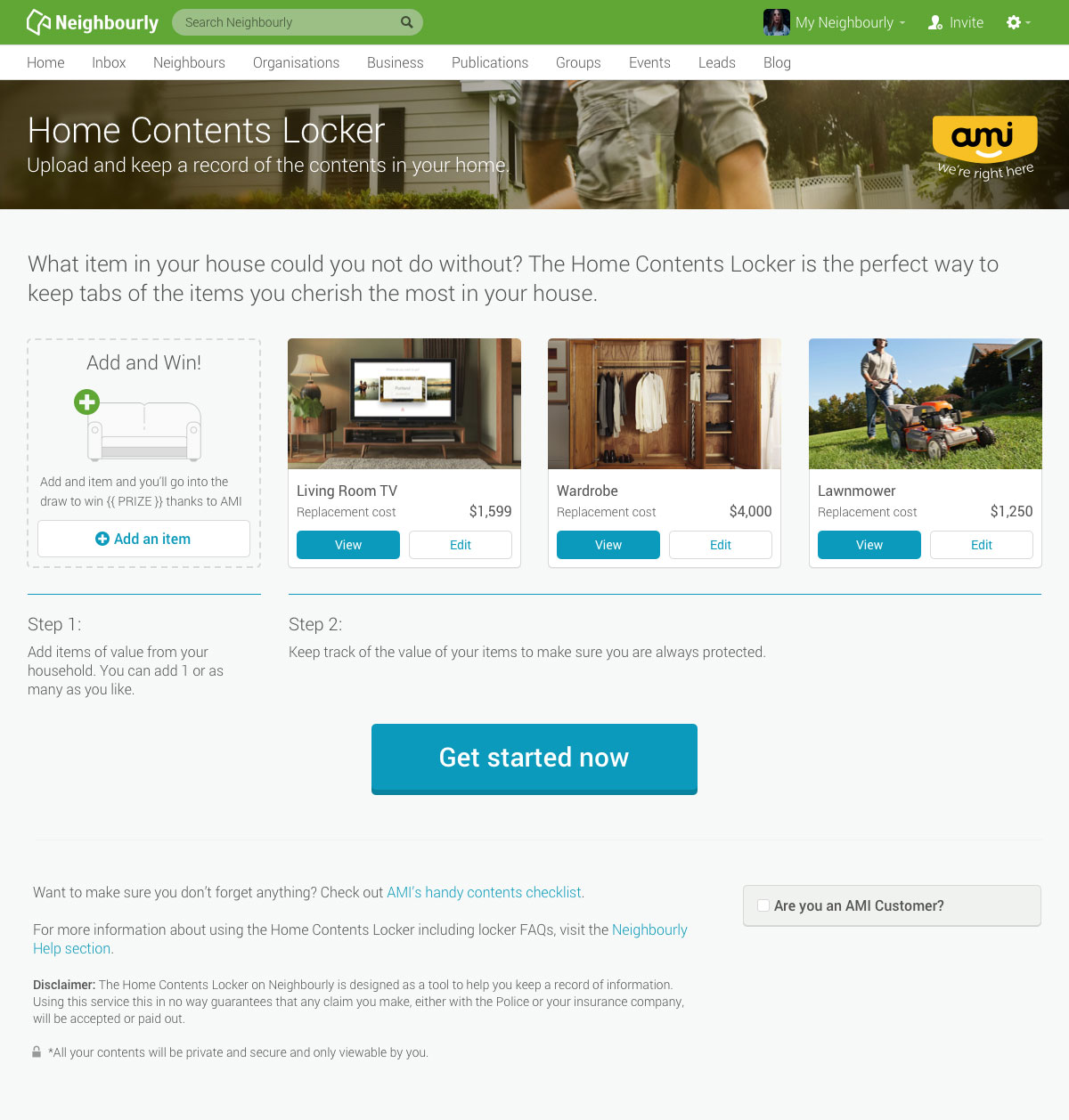
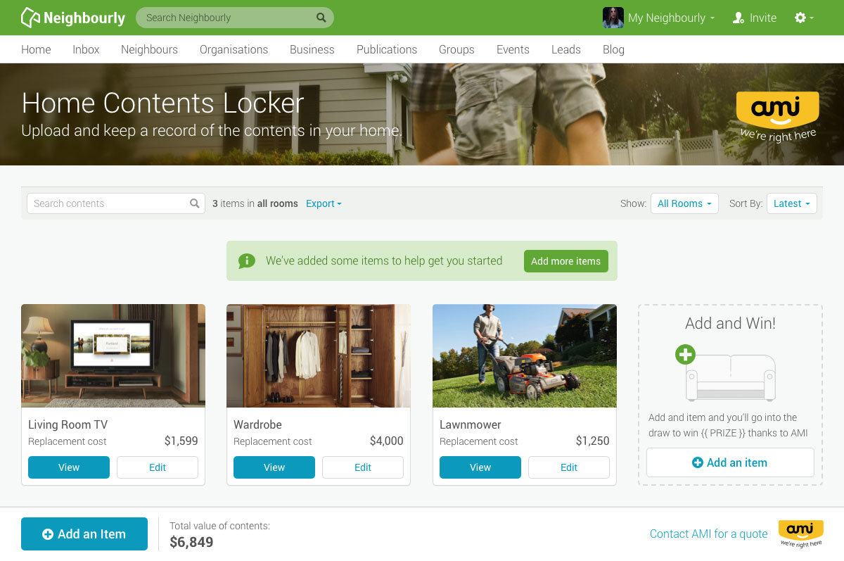
As a long standing partner of Neighbourly, AMI wanted to redesign their home contents locker presence on the site. These were the mockups that went into production.
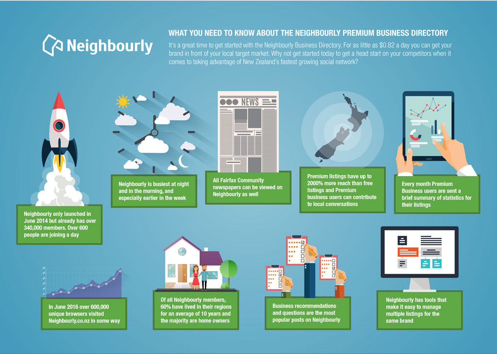
We needed to promote our Premium Business offerings to prospective businesses. This was the creative I designed for that purpose.
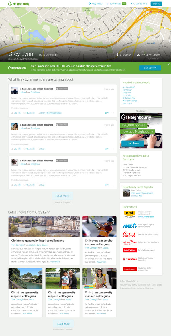
Neighbourly was primarily a closed social network. To increase our user base, we decided to implement a 'Public pages' section. This would allow visitors to get a taste of what Neighbourly has to offer, before they sign up. This was a preliminary concept I had designed.
Here is an example of the logo and campaign page design I would undertake on a regular basis.
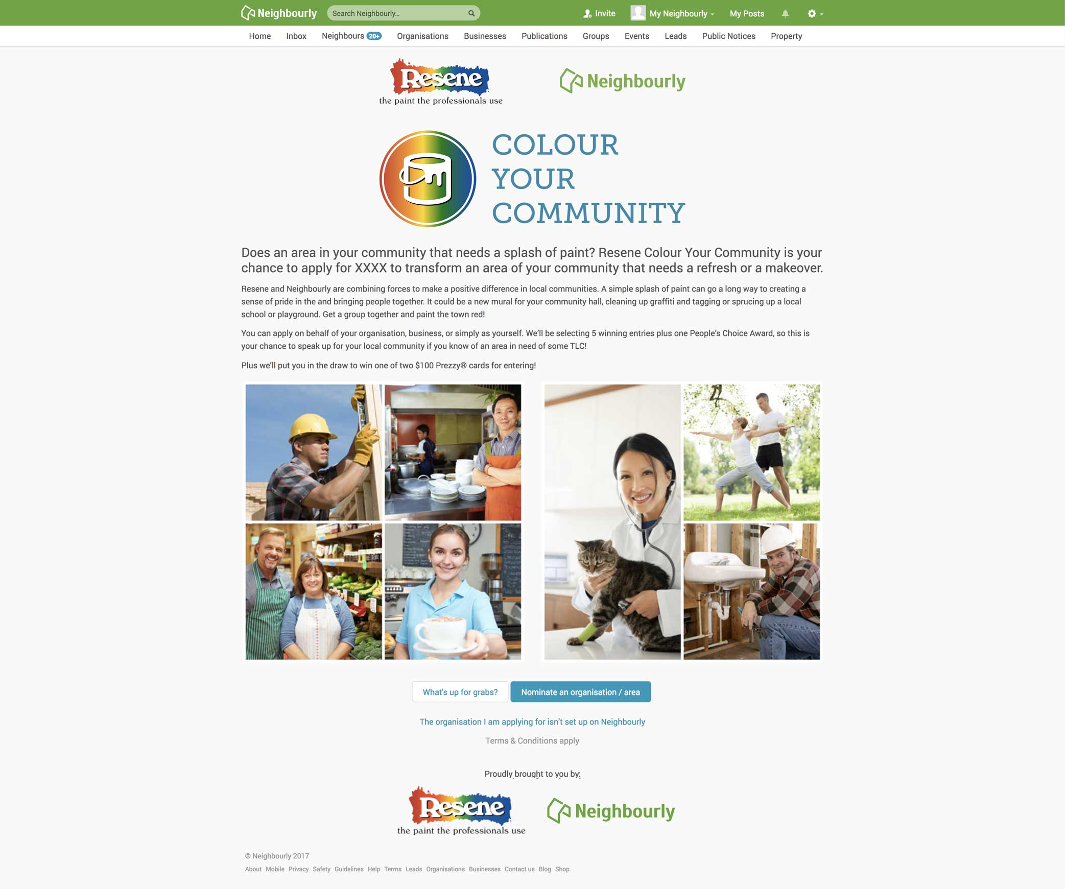
More of
